The Freight Atlas
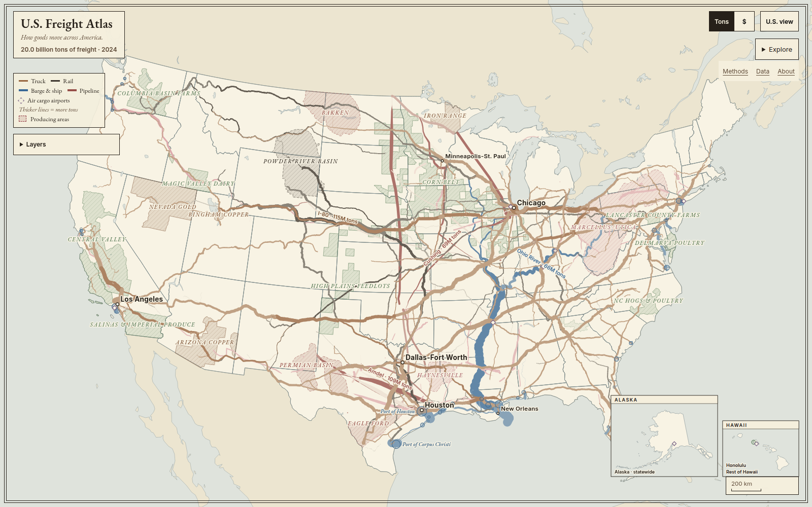
The Freight Atlas is a single interactive map of the physical economy: the trucks, trains, barges, pipelines, ports and cargo airports that move goods between the places that make and use them. Line width is freight volume. Click any line or place to see what moves there, how much, and where the number comes from.
Why I built it
The economy has a geography. GDP tables hide it, but every product passes through a small number of corridors, ports and junctions, and those places explain a lot about cost, resilience and where industry can grow. I wanted one map that shows that structure at a glance and still holds up when you zoom into a single stretch of highway or a single port.
How it works
- Data. Public federal datasets: the FHWA/BTS Freight Analysis Framework, Army Corps of Engineers waterway tonnage, EIA pipeline networks, BTS airport cargo, Census trade, and USDA, USGS, and EIA production statistics. The Data page identifies the year and coverage of each source.
- Model. Regional freight estimates are assigned to highway, rail, and pipeline networks; waterway flows use published link tonnage with river-system scaling. The map brings these sources together across about 188,000 network segments, keeping observed quantities separate from modeled estimates.
- Map. A custom canvas renderer draws the whole country at once and reveals finer flows as you zoom, so the national picture and local detail are the same map. Clicking selects the exact point you touched; the camera never jumps.
System architecture
See the end-to-end system diagram: public datasets, validation and modeling, generated assets, browser preparation, rendering, and clicked-place details.
Product decisions
- Every line is a quantity, and every visible line can be clicked.
- Unknown values stay unknown instead of becoming zero.
- Tons and dollars are separate views, never mixed.
- Numbers on the map match the numbers in the panel, and each one links to its derivation in the Methods.
How it was built
I built this with AI coding agents. My role was product owner and reviewer: defining the rules the map had to follow, checking the map in a real browser at desktop and phone sizes, and rejecting versions that were technically correct but hard to read. The full source list, vintages and coverage notes are on the Data page.